WOMAN UP
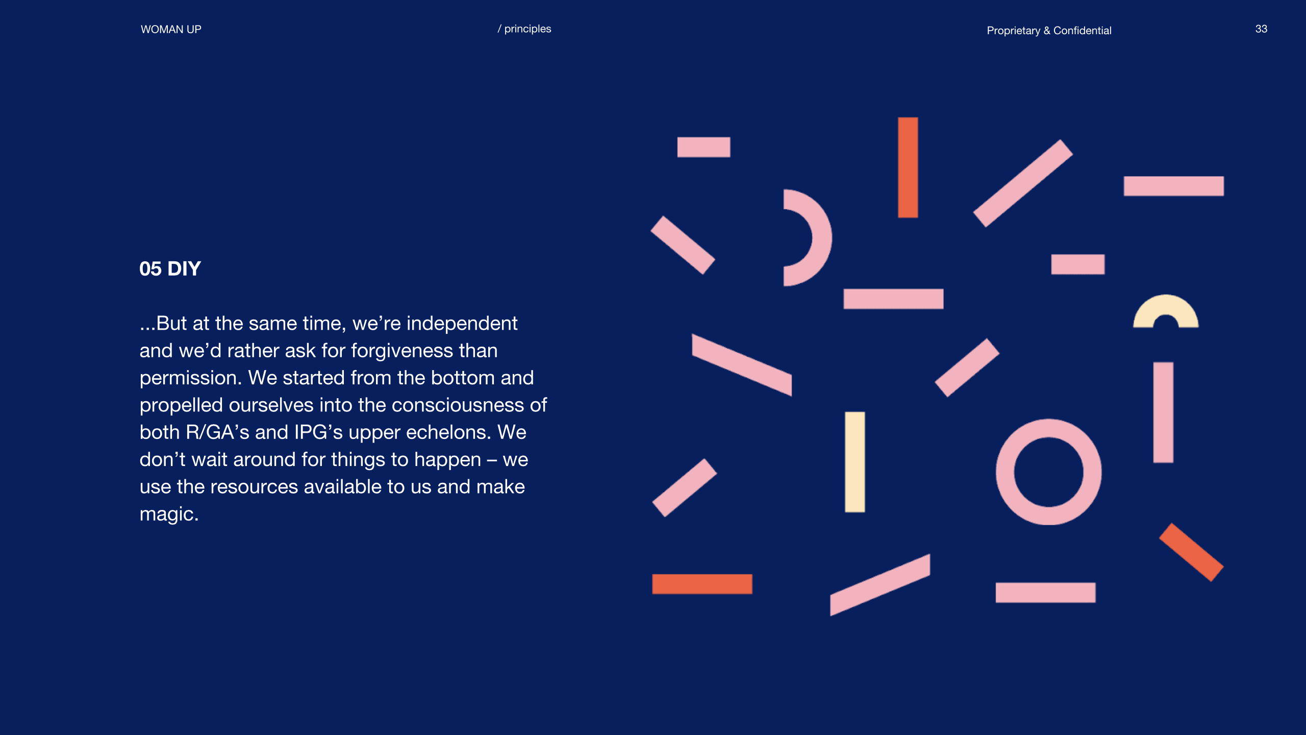
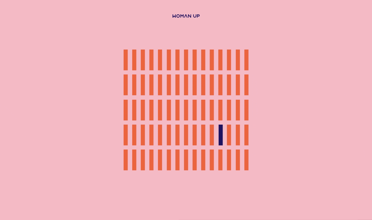
It’s hard to be a woman in advertising. We’ve all heard the stats, and they’re still depressing. 70% of graphic design students are women; yet only 11% are Creative Directors.
At R/GA we wanted to start tackling the problem, so back in 2015 we created WomanUp, a working group designed to drive change within our organisation. We use WomanUp internally as a platform to build a culture that supports gender equality, and that challenges unconscious bias in every aspect of our work. Through activities, talks, meetups and mentorship, we aim to cultivate awareness and inspire action to redress the imbalances within our company.
It’s been four years since a group of women at RGA started the initial incarnation of WomanUp and the group has scaled across offices globally, and grown to include more than 200 members. But our hastily designed brand identity hadn’t grown with us.
Early last year, we decided it was time for a refresh. Being part of WomanUp, we wanted to use our skills to benefit the initiative. It’s so important to create and cultivate spaces like WomanUp, and for those spaces to be successful, people need to stand up and actively contribute. So we teamed up to rethink everything about the group’s original visual identity — from the logo to colour choices and the design system. And the best part of the project? The fact that it was personal: this design would need to represent our colleagues and friends, and would need to communicate a celebration of inclusion, diversity and the openness that WomanUp stands for.
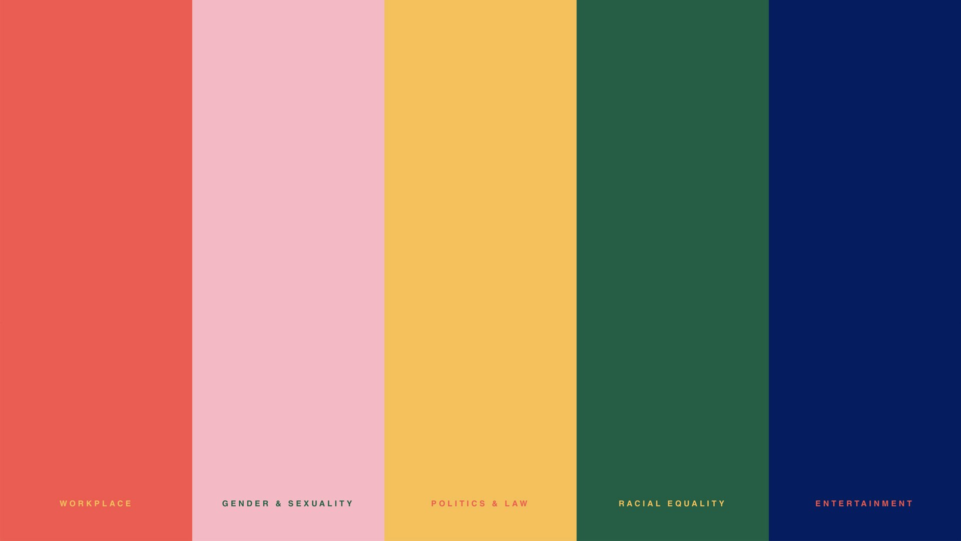
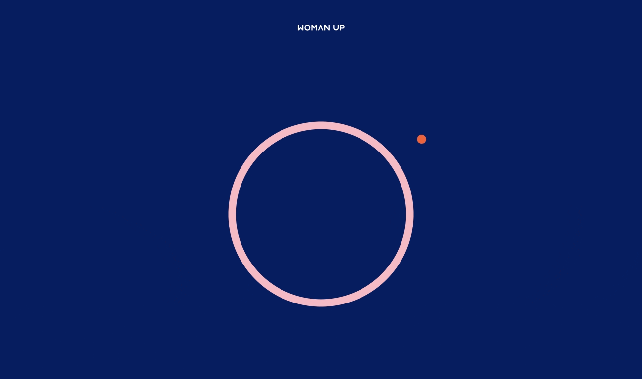
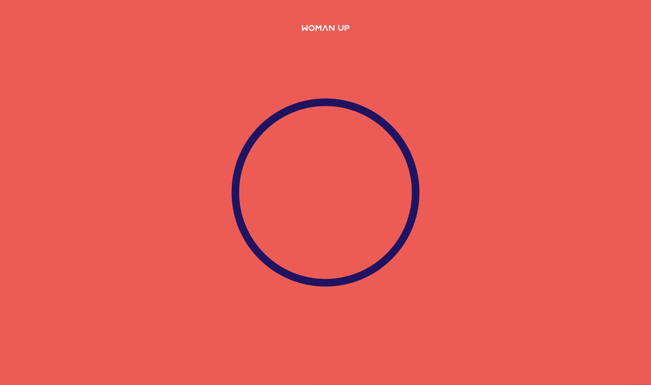
The original WomanUp branding was based on the current R/GA “mother” brand — very slick, with a typically minimal look and feel. While it was consistent with the R/GA image, we felt it could evolve to communicate the celebration of inclusion, diversity and openness that WomanUp stands for. We instantly had a clear vision in our minds of how we wanted the new branding to evolve, inspired by the clarity of swiss design and Paul Rand’s instinctive use of shape and colour, but that could also blend perfectly with R/GA’s established Bauhaus influences. So we set out to bring it to life, balancing the old R/GA style with a new distinct feel, updating the palette and art direction to create a new identity that would honour the powerful message behind it.
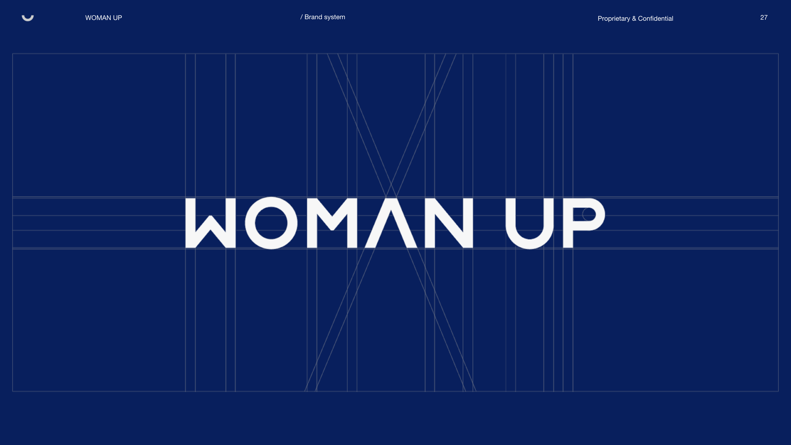
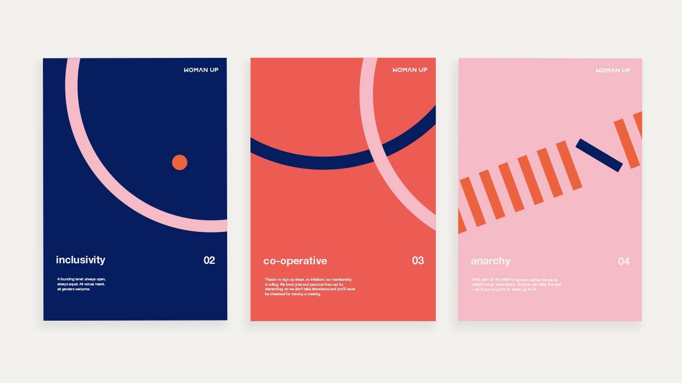
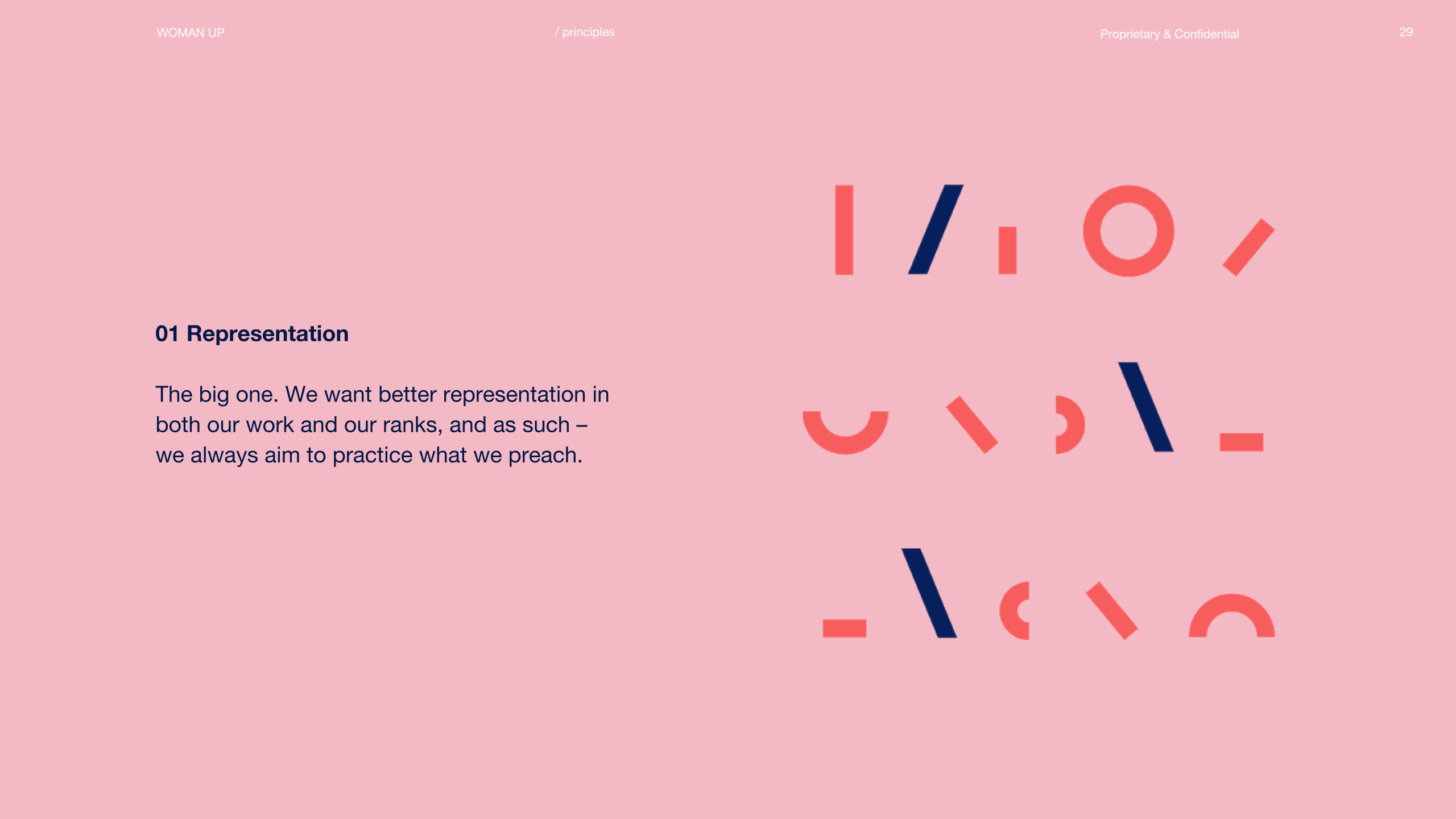
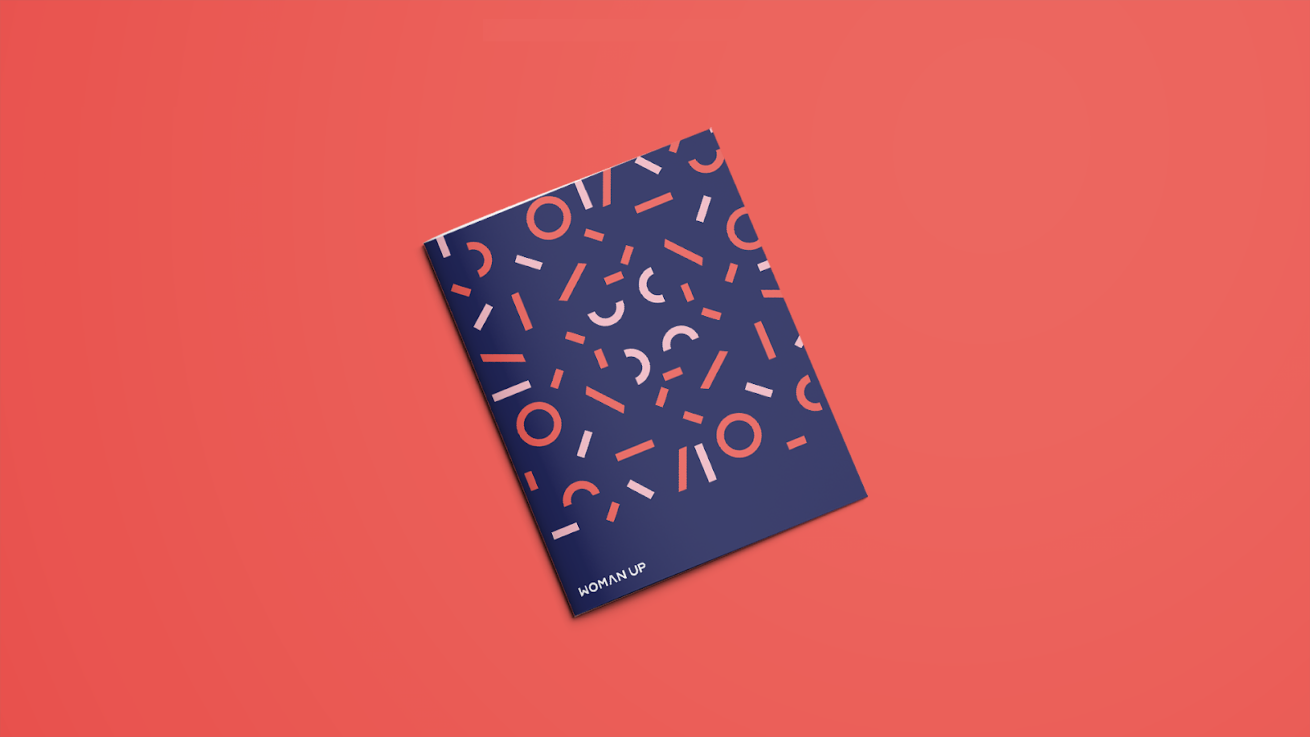
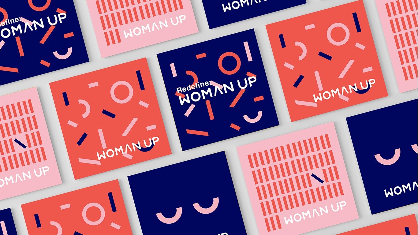
We started with the logo. We took the existing word-mark and deconstructed it into playful shapes, which we took to represent the diversity of our audience — the mix of different cultures, backgrounds, beliefs. Bringing the shapes together throughout the brand system acted as a metaphor for how the union of all these different people makes R/GA and WomanUp what it is. We used them to create a language that could communicate messages and morph into whatever we needed. For example, we adjusted the shapes of the letters and created a custom typography, using the geometric shapes to compose new forms for the letters.
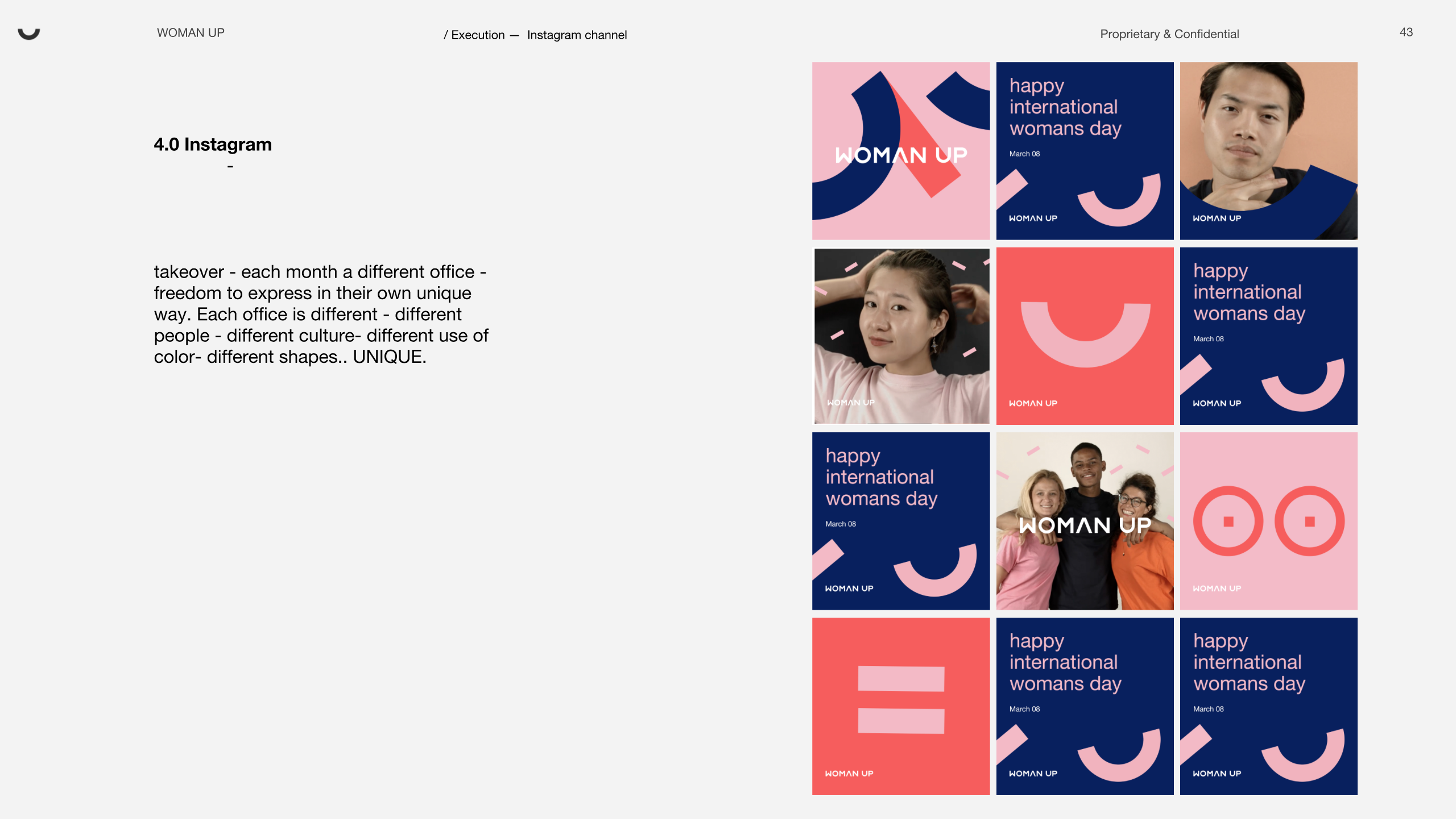
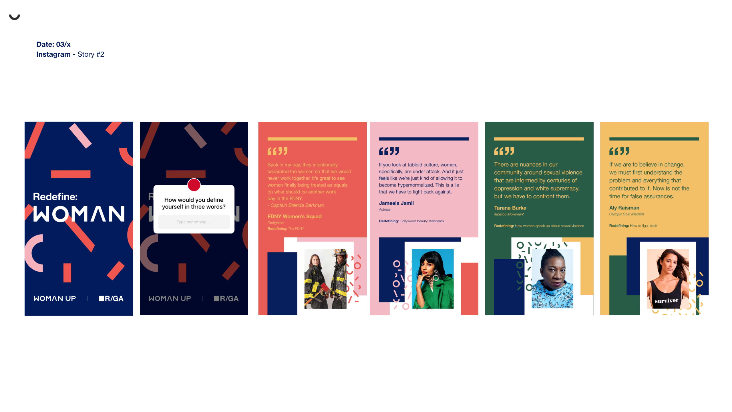
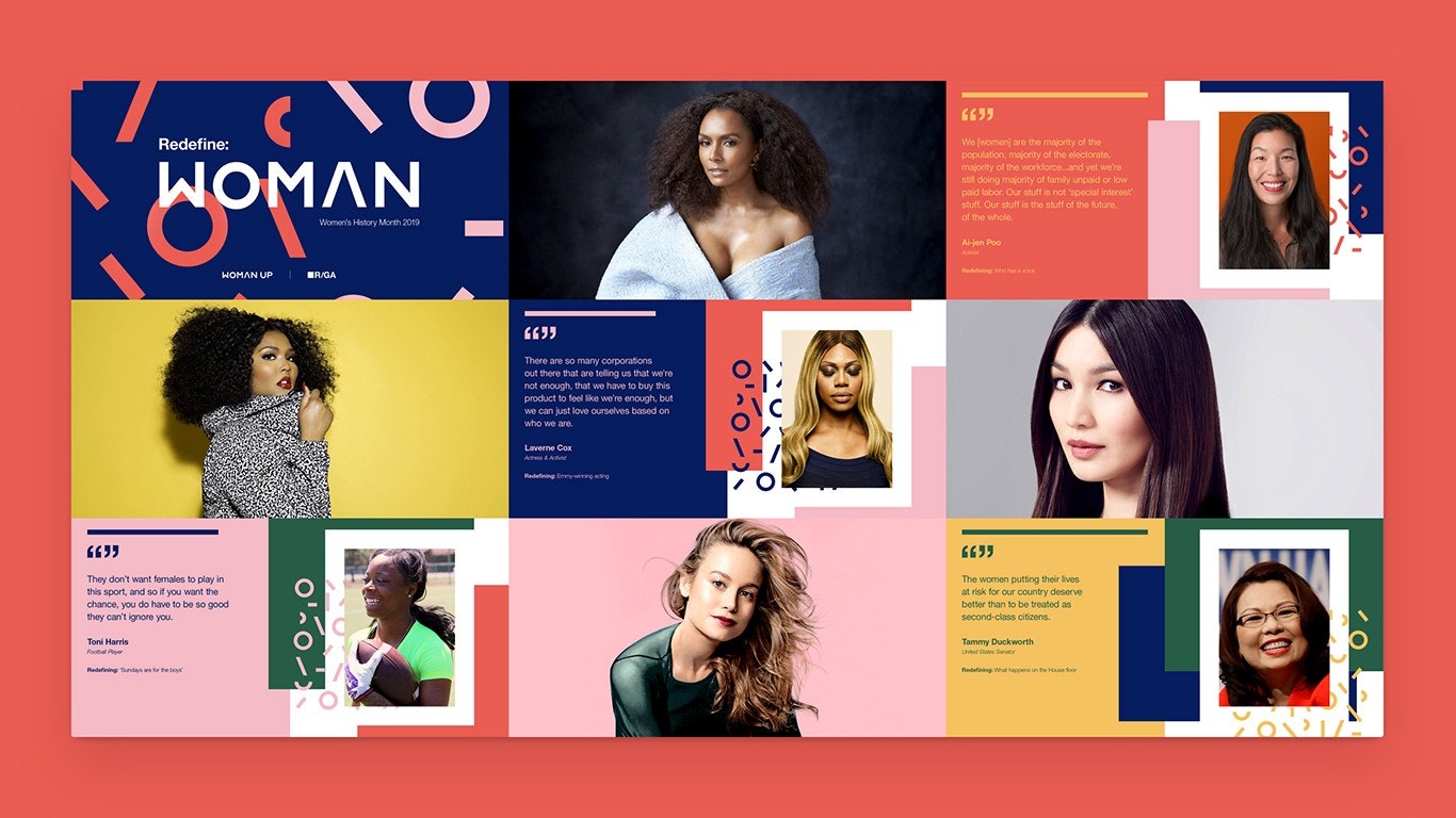
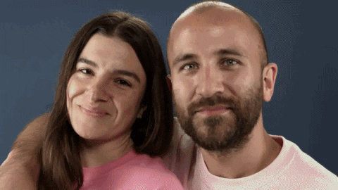
As part or the campaign, we started art directing some photo shoots that would provide imagery to support the designs we had created. We made sure these moved away from traditional corporate imagery, instead focusing on authenticity — real people, real expressions, real feelings and vibrant colours. These spontaneous studio portraits of powerful women became a central part of the campaign, and we landed them on the big screens alongside the new branding. We also created an Instagram campaign, which spotlighted our work throughout the entire R/GA network, allowing offices around the world to start embracing the new design.
As with any design process, we then started to iterate. Our feedback was positive: people felt showcasing our work colleagues in a natural, happy way on colourful backgrounds felt refreshing, personal and fun. We leaned into the informality of the design, and applied it to videos, animations and even physical products that could populate the office space. We even created a designed booklet of the 10 WomanUp principles.
We then started testing the design system on different touch points, beginning with a digital campaign for International Women’s Day 2018 created by WomanUp’s London chapter. To celebrate the female talents within R/GA London, we applied an early iteration of the new branding elements to an in-office screen campaign, which helped us understand if we were going in the right direction.
Step by step the new identity has been rolled out, and adopted by our offices across the network. More recently, the identity has been used to roll out an International Women’s Day campaign in the NYC headquarters, which provided our validation.
This journey confirmed how important it is to find time for things you really believe in, because a small initial step can lead you to have a real, lasting impact.
This wouldn't of been possibly without:
Joelle Schweiger & Oriana Gaeta